5 Tips To Optimize Your Website’s UX
1. Simplicity above the fold line
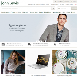
Two of my favorite sites, when it comes to UX and clean design are John Lewis and Macy’s. You will get to whatever you want to purchase in 3-clicks or less. There is no confusion and with John Lewis you can see that everything above the fold is the cornerstone of their business – clothing, electronics and homeware. Both are also outstanding for mobile as well. They are a masterful blend of traditional marketing concepts coupled with digital commerce.
Most of us do not have the budget or intellectual resources that either of these companies possess BUT we can certainly glean form the hard work, research and data they have invested in over the years – there is a reason their website are successful. You can find a good starting point by emulating some of the mapping and design qualities of your largest competitors.


2. Gather the data
Data is your best friend with a quality UX design and mapping. You absolutely have to drill down and make adjustments accordingly. The UX adjustment will vary widely according to the amount of traffic going through your website. For some, the amount of data could be adequate in a week – others a month. Whatever the case make sure you have collected enough and weigh heavily on the past performance. This should be done year on year not month to month, so look at the figures for February 2017 against February 2016 – NOT February 2017 against January 2017. There is some good heatmapping software out there and one that I like is Hotjar. You can get going for free and it will give you some really good insights on how traffic is reacting to your website – in particular your homepage. Keep your eye on and follow the data make adjustment for the UX as the key here is to get the potential client to the product in as few clicks as possible.
3. Follow the Data
The UX is a continuous flow through the entire site; from the homepage to the thank you page, it all has to be looked at and scrutinized. In theory, the UX data trail only ends at the thank you page – after that your tracking data kicks in (I will look at this at another time). You also need to think of the mapping as John Lewis and Macy’s look at people moving through their physical store – do you think as you walk through these retailers that the displays and aisles are set out in a random order? Next to the homepage, abandon carts are an issue and the amount of data that you can collect to get this under control, from heatmapping and Analytics, will all be well worth your time. During the checkout process each phase needs to be streamlined; just think of Amazon 1-click check out, there is a reason it is not 2-click checkout. Simplicity and ease of action are the watchwords.
4. Keep and recycle old designs
You will always have access to your data but most of us do not think of keeping easy access to our older designs. Especially if you are using heatmapping to track the UX it is simple to create a timeline of changes and events for future reference. You will be surprised how looking back at the data will help lead you down the right design and mapping for your site. Every few months I print everything out and spread it out on the conference table and really get into it – I have everyone look at it and provide feedback. This is not only good fun but you will be surprised what will come out of it – directions you never would have imagined on your own.
5. Don’t fear change – Learn to learn and learn to change
Don’t be stubborn-headed about what “you” think your client want to see. Yes, you know your business but let your customers (in the form of data and mapped UX) tell you how your website should look and where to take them. We are transcending design elements here as there is no accounting for taste. We are talking UX. If you want an image of your dog on the homepage, that is fine, and if you follow some of my simple advice above you will quickly see if that is the best decision and what your users what to see – if not will you change it? We have to get over the feeling that the website is an emulation of us – it needs to be viewed as my store front, my top salesman, my PR company, my lead generation team and my data mining team. It is in essence an employee and needs to be trained, nurtured and stimulated to perform for you.
Follow us #TheTronWay
